Business Solutions
A Print Checklist for Your Poster Files
A poster that looks right on screen can still print wrong. A pre-print checklist: file format, color mode, fonts, logo versions, and a proof round.
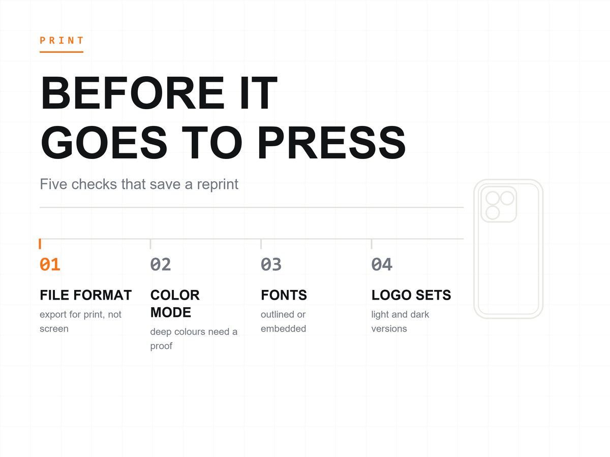
A poster that reads well on screen can still print wrong: the dark ground softens, the orange drifts, the fine text thickens. iFunSmart sent three trade-show posters to press this season, and every file went through the checks below first. The list is short. Skipping it costs more.
Last updated: November 4, 2026.
A Screen and a Sheet Are Not the Same Medium
A screen is a light source. Paper is not: it reflects the light in the room and carries whatever ink lands on it, so a monitor adds brightness to every shade and quietly flatters the design. A file that looks finished on screen can arrive from the press with less punch than the version you approved.
The gap shows most where color is hardest to fake. Dark backgrounds often print softer than they look on screen, and saturated warm tones are the shades most likely to move when light-mixed color becomes ink-mixed color. Treat that as a tendency to verify, not as a law of printing, because inks, machines, and materials all have a say.
The honest referee between the two media is a proof. A proof is a printed trial of the final file, checked before the full run. Paper cannot glow. What the proof shows is what the wall will show, and every check below is designed to reach that round with as few surprises on it as possible.
The File Itself: Format, Color Mode, Fonts
Ask the print shop what it wants before you design, because formats and machine settings differ from shop to shop. Then export a print-friendly file to their specification instead of sending a screenshot: a screenshot carries whatever the monitor did to the color, crops the layout to the screen, and leaves the trim margin to chance. Export the finished layout as a file meant for ink.
Color mode is where screen habits break. Screens mix light in RGB and presses lay ink in CMYK, and the conversion between the two quietly rearranges some shades. A poster whose hero is a color-heavy product photo of a cherry-red case for the iPhone 18 Pro lives inside exactly that risk, because deep saturated shades sit near the edge of what ink reproduces without a fight. Convert the file first, then look at it again before anyone signs off.
Fonts fail quietly until they fail loudly. If the file names fonts the shop's machine does not have, the machine substitutes its own and the lines reflow: a headline wraps where it did not, a tagline slides into the logo, a date drifts off its baseline. Convert text to outlines or embed the fonts before the file leaves your desk, and keep an editable copy of your own for the next round of changes.
The Brand Assets: Logo Versions and Safe Margins
A logo that works in one context struggles in another, so prepare versions before the layout exists. Keep a horizontal lockup for wide spaces, a stacked one for tight corners, and a single-color version for layouts where full color turns muddy. Give white-ground layouts one set and dark-ground layouts another, because recoloring a logo on screen the night before a deadline is how thin, gray logos end up on printed walls.
Trim eats edges. Posters are cut after printing, and the cut line moves a little with each job, so keep names, booth lines, and contact details well inside the sheet. Everything the poster must say should survive the cutter having a bad day.
Before any of this ships, print one page on an office printer and read it at arm's length. It is the cheapest look the file will ever get.
Dark Backgrounds Need a Closer Look
White text on a deep ground is the sharpest thing on a monitor and the most fragile thing on a press. Fine light type over a heavy dark area tends to thicken in print, and strokes that clear each other on screen can crowd together on paper. Small type wants the opposite arrangement: dark text on a light panel holds its shapes with far less effort than light text on a dark field. If the design must run dark, give the small print a light area to sit in.
The same caution covers photography. A poster that carries a dark product shot of an armor case for the iPhone 18 Pro Max is asking a lot of the press: a dark product on a darker ground, with every highlight in the image doing the work that contrast did on screen. Put that page at the front of the proof queue and check it at full size if the shop allows it. Dark grounds give you less margin than the screen suggests.
One Proof Beats One Reprint
A proof round costs an afternoon. A reprint costs the run, the schedule around it, and sometimes the show the poster was printed for. That trade is not close.
Typos survive on screen because you read what you meant to write rather than what is written. So read the proof word by word, slowly, the way a stranger would, and let a second reader do the same. A reader who has not seen the file before catches what you have already stopped seeing. Two people cross-reading a proof is the closest thing print has to a safety net.
We watch the same patience on the packaging side, where customers refine label layouts in rounds before production. A poster is the same job on a bigger canvas: rounds are cheap now and expensive later, so spend them while the file is still on your desk.
Common Questions From Buyers
Which file format should I hand to the print shop?
Whichever one their machine expects, which you learn by asking before you design rather than after. Shops differ in what they accept and what they can correct on their side, and the settings that matter live at their end of the process. We do not publish print specifications for every machine, and a shop asked early can usually answer in a single email.
Does printed color match the screen?
Not exactly, and the gap is widest where the design leans on color hardest. Screens mix light and presses mix ink, and the conversion between the two moves deep grounds and saturated warm shades more than the rest of the palette. Color results depend on the print shop and the material as well, so the same file on coated and uncoated stock will not look like the same poster. A proof turns that argument from opinion into evidence before the run.
Can iFunSmart print the posters for us?
We do not offer printing services ourselves, so this checklist is experience shared rather than a service menu. What we build is the product the poster advertises: phone cases made in Guangzhou, with branding support on the case and packaging side of an order. The poster belongs with a print shop. The case inside the photo belongs with us.
What to Do Next
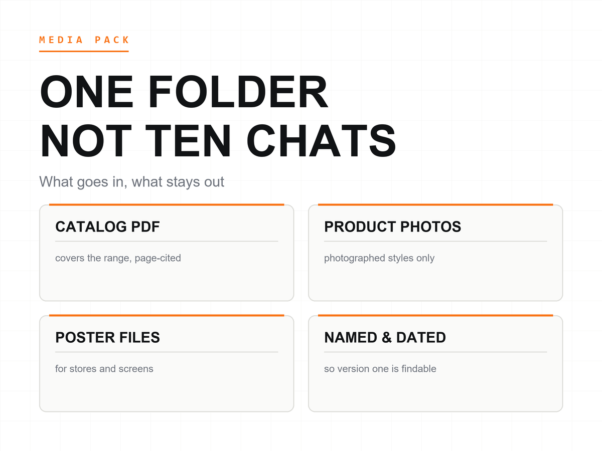
Decide what the poster must say from a few steps away, gather the logo versions and the fonts, and take the file through the checks above before it moves anywhere. For the photography inside the layout, we provide free HD images for the styles we have photographed, so ask which of your models are already covered before you brief the poster at all.
Send iFunSmart your model list, and walk this checklist once more before your poster files reach the press.
Apple and iPhone are trademarks of Apple Inc. iFunSmart is an independent manufacturer of phone cases and accessories and is not affiliated with, authorized, sponsored, or endorsed by Apple.